Mapping the Other
“Mapping the Other” is the second part of a 2 parts project- the first is “Mapping the Self.” This is a collection of 3 studies of the “other”: who they think they are, how others perceive them, and who they are. These studies are based on the researches and interviews I managed.
Description:
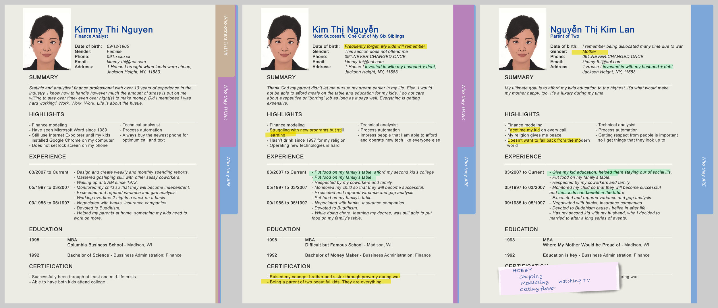
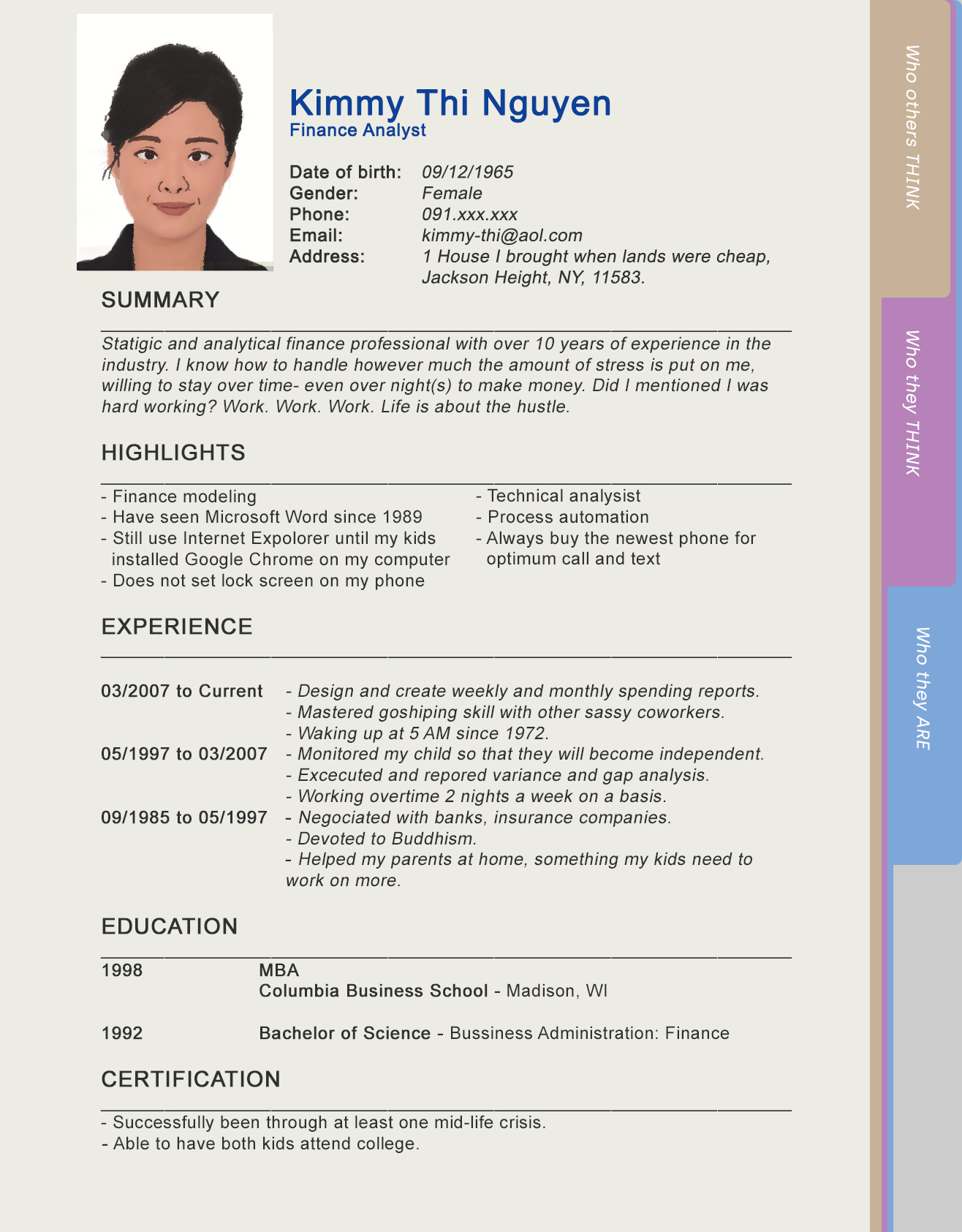
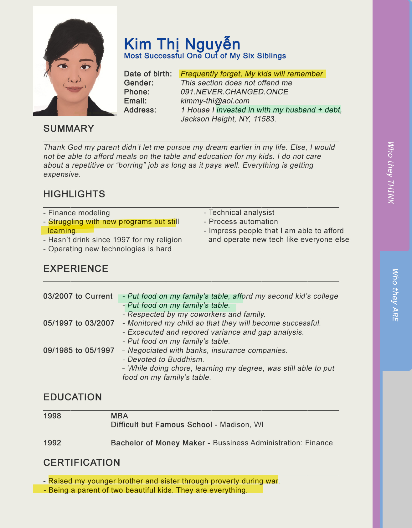
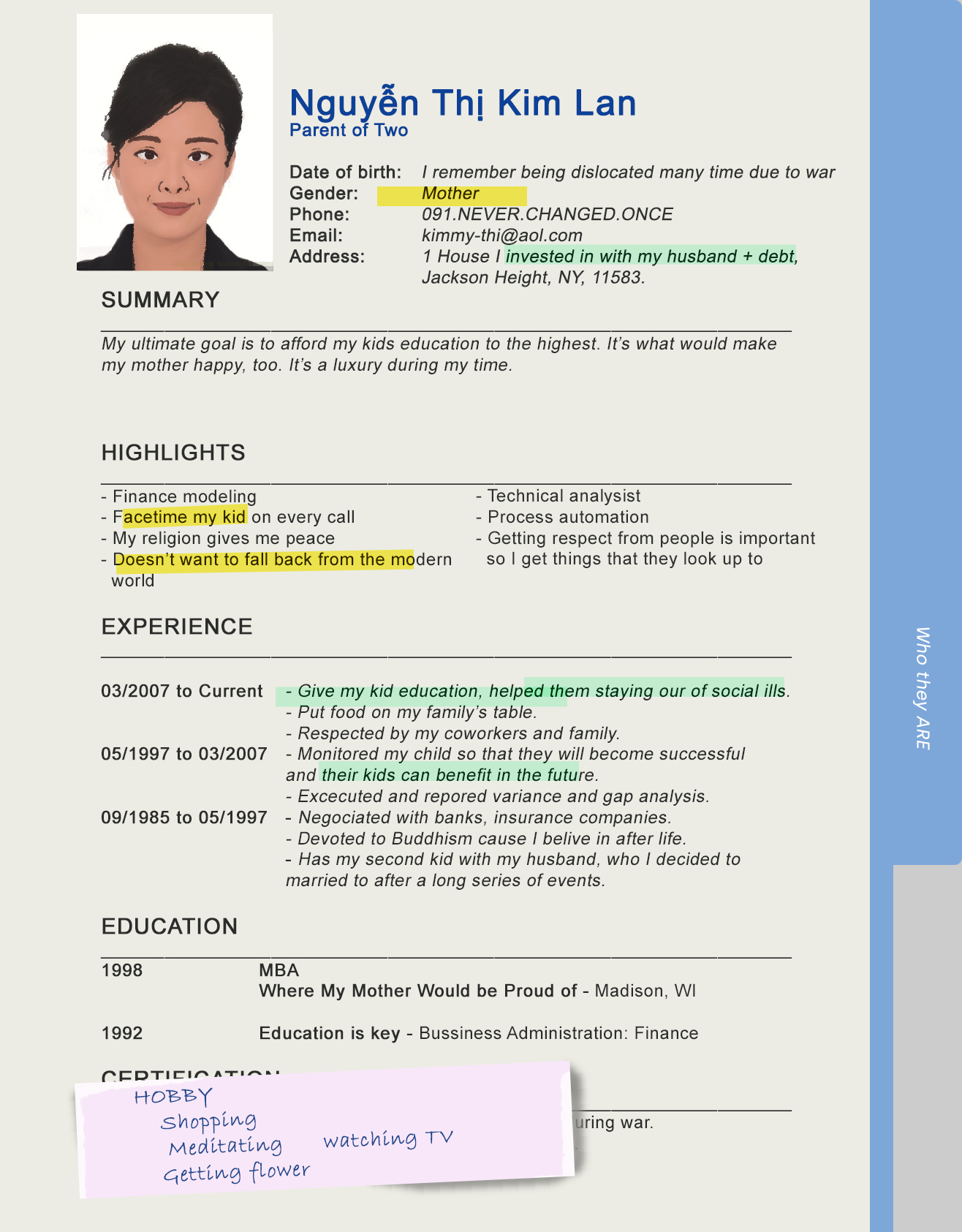
The “other” I chose to work on for this project are Asian parents in general. Since the majority interviews I have successfully conducted are of East Asian parents, I revolved the project around to them, but the message remain the same.
I wanted to create three resumes, each catered to an identity that the Other has: (1) who people think they are, (2) who they think they are, and (3) who they are. By combining the three studies together, I want to show how different versions of a “stereotypical” Asian parent is. While interacting with this project, the audience will play the role of someone who’s reviewing resumes and happened to stumble on this person’s file. With three seemingly identical resumes, the audience would feel encouraged to pay attention to the words in the resumes. Though this project may come across as stereotyping or generalizing a group of people, it is meant to make the audience intrigued and curious about the Other, and therefore would want to learn more about them.
This project is based on the three audio interviews project and a research of the ten references.
Data Visualization
For my data visualization, I chose to make a data of all the color I have used in “Mapping the Self” and “Mapping the Other”. Colors are coded from dark to light (from upper to lower square) and lower saturation to higher (left to right).

Data visualization from “Mapping the Self” and “Mapping the Other”
Process:
Firstly, I created the resumes in Adobe Photoshop CC using a general template by illustrating the profile picture and creating the texts. I went back a couple times to change here up a few things so that it would fill my artistic perspective.
Initially, the highlights and notes were not presented, the background was a white-A4 paper. They are added to get attention on the keywords/differences between first and next page and to add an office aesthetic.
Illustrating the profile and create texts
Refine and adding final touches to the resumes
After the resumes were finished, I put them in Processing to test the sizes. During this step was when I decided that it’s more reasonable to see tabs next to these resumes, which would be easier for navigation.
Testing the resumes on Processing

Creating the tabs
On processing, I made a pen following the mouse to enhance the office experience. After all the main components are set, I went back to refine the code and fixed glitches.